CONCEPT DESIGN IDEAS
Impression of my site
I thought of development with my site. 8 Fulton street area in DUMBO was not as developed as is now. It is now very active(like the men in my collage), and all eyes/ interest is one direction (represented by image on bottom left)....Brooklyn Bridge Park. I also thought about busy and never forgetting nature because of the waterfront and park (the nature image in the background).
The word “connection”
Thinking about the word connection, a bridge comes to mind its major connecting elements whether its cables or its pathway connection comes to mind. Links of a chain and an interlocking object (figure in the background). As always WIFI connection is also represented in the top left and electrical connections at the bottom right.
Based on the program of my project
I want to focus on HYBRID since my project combines two elements of the arts. I thought about what similarities fashion and music entail and came up with RHYTHM. Rhythm of a walking person and rhythm of a musical beat. Waves of sound and shape of the human silhouette are represented in this collage.
Thinking about development in heights and pathways sort of the way music flows through your mind and the perspectives in which fashion can be viewed.
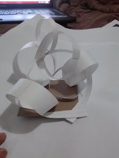
This model defines my connection board three separate entities of different thicknesses connected like links on a chain
This model evolves from the first model and incorporates a bridging effect, thus giving height and volume.
The spirals of this model represents the process of drawing the treble clef and the shape represents the way sound waves are ejected from its source whether by the feet of a model or musical instruments.
Sound waves emerging from its source goes from a higher density to a lower as defined in this model
The movement in the image in the center of the third collage reflects an 'up and down' movement
TAKING FROM THESE CONCEPT MODELS IM USING: the way sound waves are ejected from its source whether by the feet of a model or musical instruments. Interpretation of these waves and the waterfront gives me a series of rings also incorporating the connecting elements of the surrounding bridges very close to my site.


.jpg)


The boards look great, but I need more explanation. Can you please explain why you selected those images and what do they mean.
ReplyDeleteAnd which site did you select? Brooklyn or Manhattan. Is there a link on your blog?
I would have to agree with Lia's comment above. Begin to look at the information on your boards as a framework or scaffold. One in which supports and underpins what a connection is. Is it a hub? an intersection? an interface? A relationship and dichotomy of two disparate yet intertwined programs?
ReplyDeleteIt is as if I'm looking into a box of unrelated toys. I'd like to see you begin to refine these graphic collages into a single line diagram or image that supports your thesis.
With the models, It is interesting that each model has a base. The base seems like the most important thing here and something that without, your model would not be supported. Try building these same models without the base. The base here are like training wheels and its time to take them off. In doing so, you will be challenging the interconnectedness of the elements directly. Obviously, the "base" or site in this case, will re-present itself which will further inform the concept you are working so hard to manifest.
Good beginning, keep it going.... be critical.
The boards are interesting, but I'm not making the connection between your statement and the boards. I think that they may have been a starting point, where you were trying to identify and organize thoughts, like a collage. Another round of editing and simplifying the images would help bring out images strong enough to stand on their own.
ReplyDeleteIf you are thinking about fashion and music, further identify what their similarities are, and use them to inform your design. Specifically that each has a surface that is supported by an underlying structure.
I find your model studies your most exciting work so far. They are gestural, simple, and unforced. I see surface and structure in each. Quite the opposite of your boards. I don't see the base as a distraction. I see it only as a casual mounting surface for your gesture models. However, start to think of the site as a part of your solution.
I think you are heading to the right direction, but totally agree with Shawn. Why are you limiting yourself with the base.
ReplyDeleteTry and see which spaces need light, and which do not . May be you can start going underground. I would like to see more positive and negative spaces.
I missed this addition to the post as you just added to and existing post and you should create a new post for each step. As I left you in class on Monday you were trying to visualize your spaces in 3d. I think you should make a physical model taking your conceptual model into an enclosed structure - carving into the ground and looking at the solids and voids.
ReplyDelete